Overview
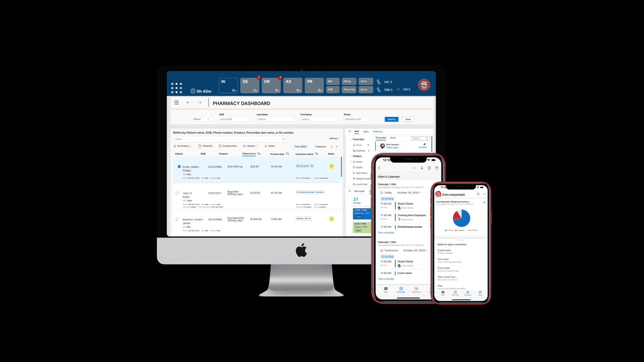
Redesigned Renewal Rx, the prescription-processing workflow inside Walgreens’ legacy pharmacy system (IC+), replacing a decades-old, overloaded interface with a modern, task-focused design — improving task completion by 80%.
Introduction
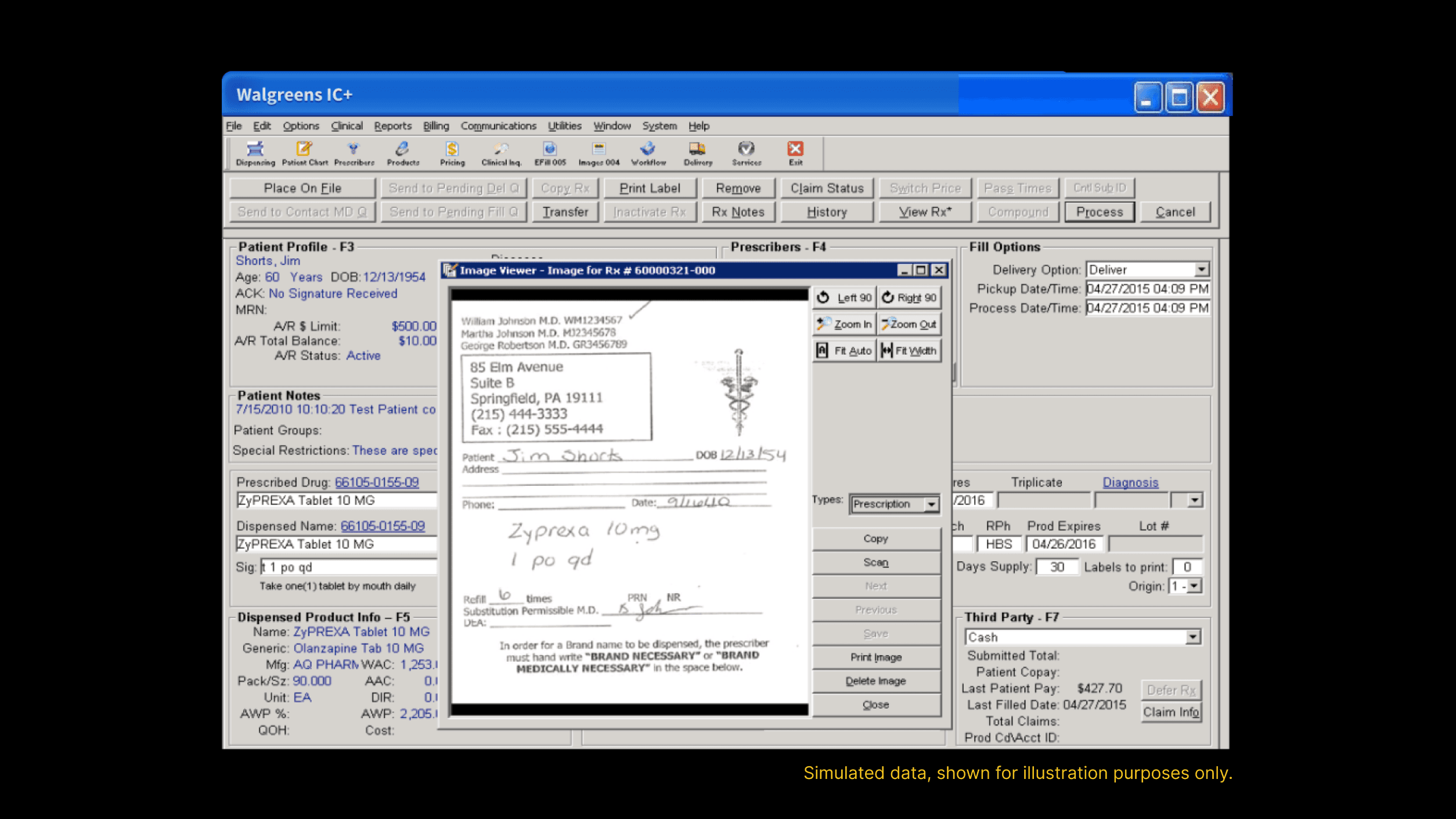
Walgreens pharmacy staff process prescriptions through IC+, an internal system built for functionality, not usability, over decades of incremental additions. Routine tasks — reading a scanned prescription, entering patient and billing data, leaving a note for another pharmacist — all ran through a dense, dated interface that hadn’t kept pace with how pharmacists actually work.
Problem
The legacy interface had no visual hierarchy, overcrowded layouts, inconsistent labeling and placement, and no modern interaction patterns — making routine prescription tasks error-prone and mentally taxing, especially in a fast-paced, high-pressure pharmacy environment.
Research
Analyzed internal usage data and gathered direct input from pharmacy staff to find where the legacy system broke down — from illegible scanned prescriptions to components like a Preferred Language dropdown that buried commonly-needed options. Full research detail is in the presentation deck.
"
1 in 5 people in the U.S. speak Spanish at home.
Ideation
Documented a dedicated internal design language for pharmacy workflows — the PILL Design System, built around five core principles (clarity, consistency, accessibility, scalability, efficiency) — then applied it to every screen and co-created workflows with pharmacy staff using interactive prototypes early in the design cycle, turning initial skepticism into advocacy before a single line of code shipped. Full documentation is in the presentation deck.

Solution
1. Structured, scannable layouts. Dense, all-on-one-screen forms became modular sections — Patient Information, RX Information, Billing Information — each clearly labeled with auto-fills and accessible input fields that prevent errors by design, rather than catching them after the fact.
2. An RX viewer designed to be read. The scanned prescription itself didn't change, but its container did — a dedicated, multi-tab viewer (RX File, Patient File, Doctor File) with clear navigation controls and metadata surfaced up front, cutting down on the misreads that came from squinting at a flat scan.
3. Patient notes as a chat thread, not a wall of text. Replaced a cluttered, hard-to-scan notes field with a streamlined comment-thread UI — attachments, inline rich controls, and persistent history — so context between pharmacists reads like a conversation instead of a log.
4. A Preferred Language dropdown rebuilt around real patients, not alphabetical order. Reordered using actual usage data so the most commonly needed languages (Spanish, for one) surface first instead of being buried alphabetically — built as a reusable, token-based component in the PILL Design System for consistency across future screens.
5. A phased, validated migration. Rather than a risky full cutover, the redesign shipped as isolated, low-risk modules (prescription scanning, patient notes) validated by pharmacy subject-matter experts in parallel testing environments, keeping pharmacies running through the transition.


Impacts
Improved task completion by 80%. The phased rollout and SME validation meant zero disruption to live pharmacies, while early co-design with staff turned initial resistance into advocacy. Engineering collaboration on performance kept the experience fast even under high traffic, and documented tab order plus a reusable design system reduced implementation ambiguity and improved accessibility compliance.

